


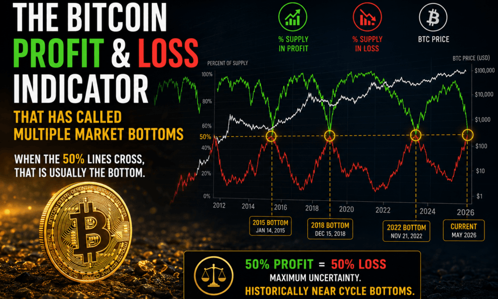
Bitcoin investors have access to hundreds of indicators.
Some focus on price action. Others track miner behavior, exchange flows, or on-chain activity.
One of the simplest indicators may also be one of the most revealing:
It’s called Supply in Profit vs Supply in Loss, and historically it has appeared remarkably close to major Bitcoin market bottoms.
Table Of Content
What Is Supply in Profit and Supply in Loss?
Every bitcoin has a price at which it last moved on-chain.
If Bitcoin’s current market price is higher than that last transaction price, that coin is considered to be in profit.
If the current price is lower, the coin is considered to be in loss.
When these values are aggregated across the entire network, we get two metrics:
- Percentage of Bitcoin supply currently in profit
- Percentage of Bitcoin supply currently in loss
During bull markets, almost everyone is sitting on gains. The profit percentage rises toward 90% or even 100%.
During bear markets, things change dramatically.
As prices collapse, more coins move underwater and the percentage of supply in loss begins to rise.
The 50/50 Line
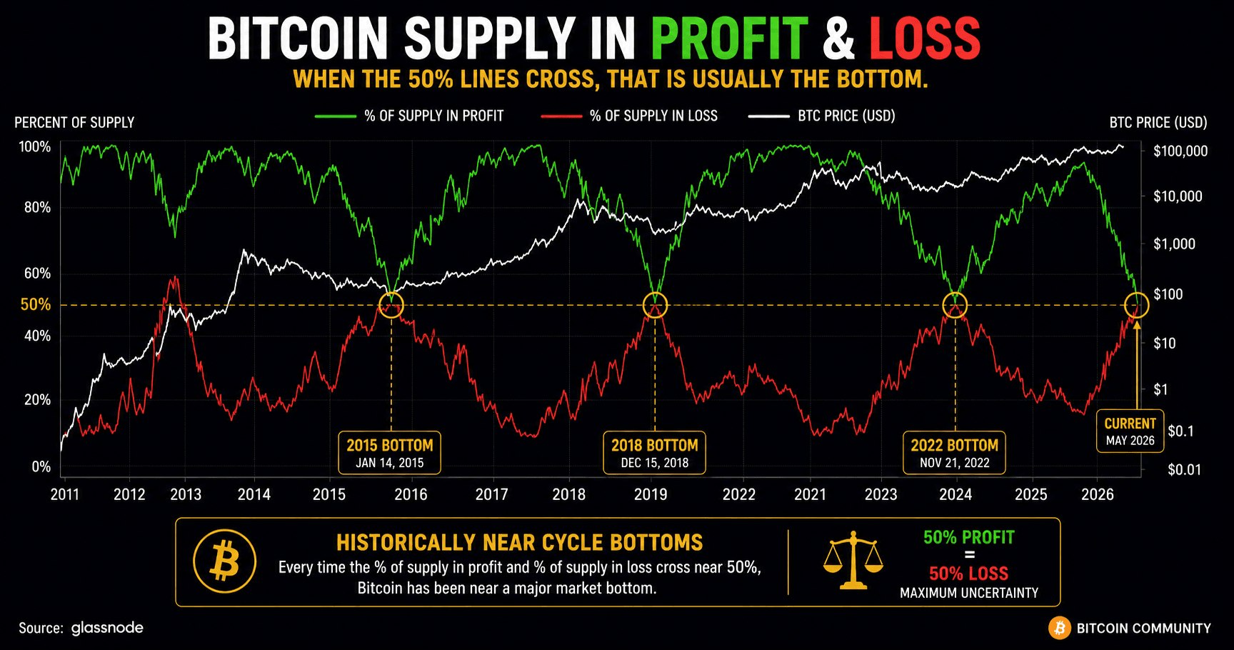
What makes this chart particularly interesting is the point where both lines meet.
When roughly half the Bitcoin supply is in profit and half is in loss, the market enters a state of maximum uncertainty.
This is the point where optimism and pessimism are perfectly balanced.
Historically, that has often occurred close to major bear market bottoms.
Why?
Because by the time half of all Bitcoin holders are underwater, weak hands have usually already sold.
Fear is widespread.
Sentiment is terrible.
And many investors have already given up.
Ironically, that is often when long-term opportunities emerge.
Looking Back At Previous Cycles
The chart shows several moments where the profit and loss lines converged around the 50% level.
These periods occurred during some of Bitcoin’s most painful market conditions.
The 2015 bear market.
The aftermath of the 2018 collapse.
The brutal 2022 downturn following multiple exchange failures and industry bankruptcies.
In each case, the market felt hopeless at the time.
Yet these periods eventually proved to be some of the best long-term accumulation opportunities in Bitcoin’s history.
That does not mean the indicator identifies the exact bottom day.
Markets are messy.
Prices can continue moving sideways or even fall further after a signal appears.
However, the indicator has repeatedly highlighted periods where downside risk was becoming increasingly limited compared to long-term upside potential.
Why We Like This Indicator
Unlike many technical indicators, Supply in Profit and Loss reflects actual investor behavior and is very easy to understand.
It measures real economic pain.
When nearly half the network is underwater, investors become emotionally exhausted.
Some capitulate.
Others stop paying attention altogether.
Historically, those conditions have coincided with periods when Bitcoin was transitioning from distribution back into accumulation.
In other words, the market often bottoms when the majority of speculators have already been flushed out.
So What Is The Market Going To Do?
The latest reading shows the two lines moving towards each other again.
That does not guarantee a bottom.
No indicator can do that.
But it does suggest that a large portion of Bitcoin holders are no longer sitting on substantial profits.
Historically, these environments have produced some of the most interesting opportunities for patient investors.
The key lesson is not that the indicator predicts the future.
The lesson is that when fear becomes widespread and large parts of the network are underwater, Bitcoin has often been much closer to a bottom than a top.